The Enduring Emblem: A Deep Dive into the U-Haul Logo

The Enduring Emblem: A Deep Dive into the U-Haul Logo
The U-Haul logo is more than just a symbol; it’s a vibrant, instantly recognizable icon that has become synonymous with moving, new beginnings, and the quintessential American do-it-yourself spirit. For over three-quarters of a century, this distinctive emblem has graced millions of trucks, trailers, and storage facilities, guiding individuals and families through life’s transitions. Its enduring presence and consistent design have cemented its place in the visual lexicon of North America, making it a powerful testament to effective branding. This comprehensive article will explore the U-Haul logo from its humble origins to its current status as a cultural touchstone, dissecting its design elements, tracing its evolution, and understanding its profound impact on brand identity and consumer perception.
The Genesis of an Icon: Early Years and Founding Vision
U-Haul’s story began in 1945, when Leonard Shoen, a World War II Navy veteran, recognized a pressing need for affordable, accessible moving solutions for families relocating after the war. Starting with just a handful of trailers, Shoen pioneered the concept of one-way trailer rentals, allowing customers to pick up equipment in one location and drop it off in another. From the outset, a clear, consistent visual identity was crucial. With a limited budget and a sprawling, decentralized network of agents, U-Haul needed a logo that was simple, memorable, and easily replicable across diverse equipment and marketing materials.
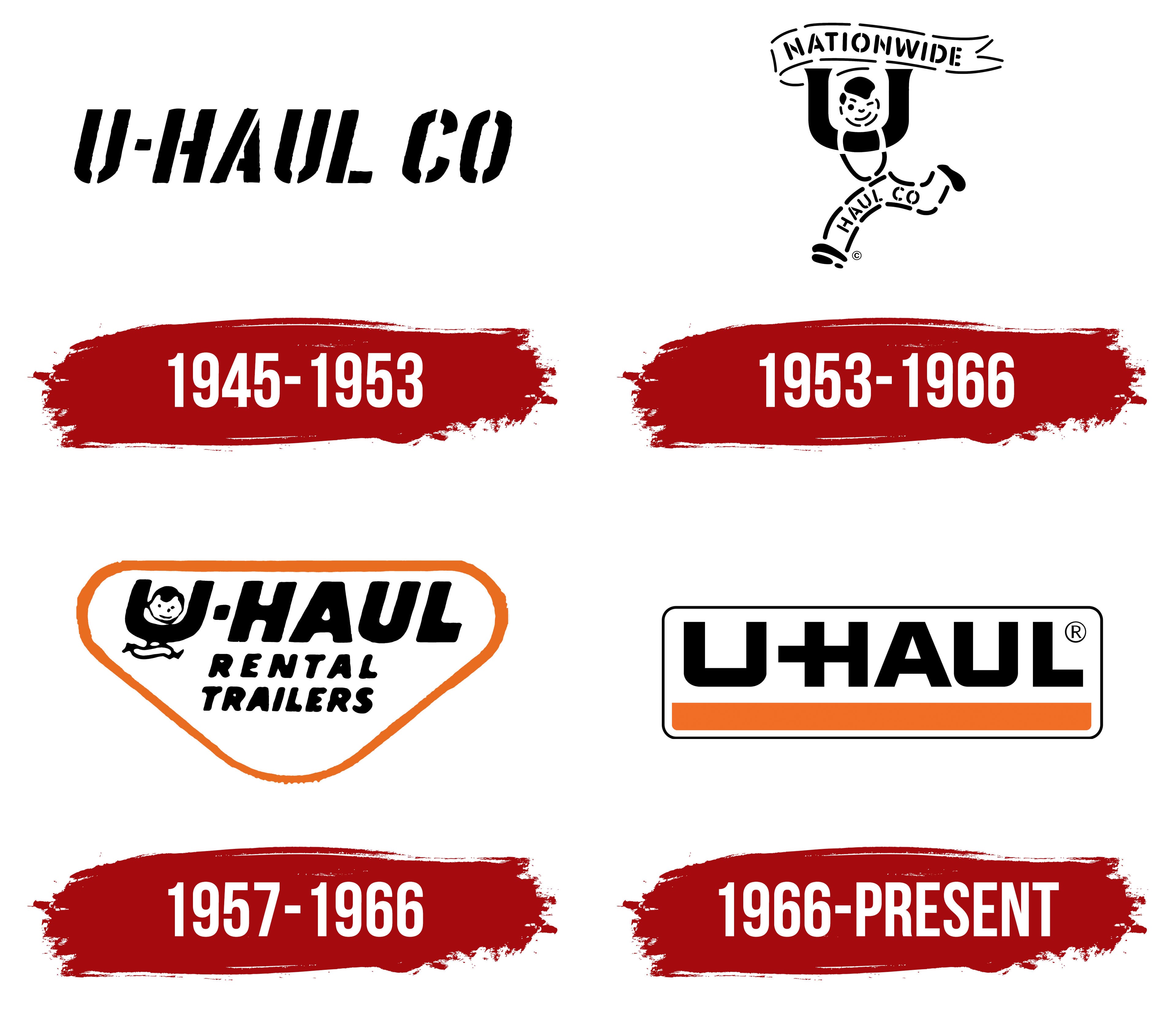
The initial iterations of the U-Haul brand mark were straightforward, often hand-painted, focusing on clear legibility of the company name. The core idea was to project reliability and approachability. The earliest designs likely emphasized the "U" for "you" (the customer) and the concept of "haul" (moving goods), laying the groundwork for the more refined logo that would soon become ubiquitous. This foundational period established the logo not just as a pretty picture, but as a functional identifier that built trust and facilitated the company’s rapid expansion.
Dissecting the Design: Elements of Recognition
The U-Haul logo’s enduring power lies in its masterful simplicity and the strategic use of fundamental design elements. Each component contributes to its overall effectiveness and immediate recognition.
-
The Color Palette: The most striking feature of the U-Haul logo is its vibrant orange and crisp white color scheme. Orange is a color often associated with energy, warmth, enthusiasm, and visibility. It stands out dramatically against most backdrops, making U-Haul trucks and trailers highly noticeable on roads and in neighborhoods. Psychologically, orange can also evoke feelings of affordability and accessibility, aligning perfectly with U-Haul’s brand promise. White provides a clean, stark contrast, enhancing legibility and suggesting simplicity and efficiency. In some applications, a deep blue might also be incorporated, often for text or outlining, adding a sense of professionalism and trustworthiness.
-
Typography: The U-Haul wordmark utilizes a bold, sans-serif typeface that is both strong and friendly. While not overtly decorative, the lettering possesses a unique character that makes it instantly identifiable. Its substantial weight ensures excellent readability, even from a distance or at speed – a critical factor for a logo displayed on moving vehicles. The slight rounding of corners in some versions softens the impact, making it approachable, while the overall robust nature conveys strength and reliability, crucial for a company entrusted with people’s most valued possessions.
-
The "U" Shape and Movement Motif: While not always explicitly a distinct graphic, the "U" in U-Haul often takes on a subtle, almost iconic role within the overall design. Sometimes it’s subtly emphasized, or the entire wordmark might be encased in a shape that hints at a "U." This letter inherently connects to "you," the customer, reinforcing the company’s customer-centric approach. Furthermore, many U-Haul logos, particularly those on vehicles, incorporate an implied sense of forward motion. This might be achieved through an upward slant, a subtle arrow-like shape, or simply the dynamic placement of the wordmark itself, all communicating the core service of moving and progression.
Evolution and Adaptability: A Logo Through the Decades
Unlike many brands that undergo dramatic logo overhauls every few years, the U-Haul logo has maintained remarkable consistency throughout its history. Its evolution has been characterized by subtle refinements rather than radical redesigns, a testament to the original design’s strength and the brand’s commitment to continuity.
From its earliest, simpler renditions, the logo gradually moved towards a more standardized and polished appearance. The core elements – the bold "U-Haul" text and the distinctive orange and white – remained steadfast. Minor adjustments might have included changes in the exact shade of orange, the precise kerning of the letters, or the addition of a subtle outline or shadow to give it more dimension. For instance, early versions might have been a flat orange; later versions could feature a more saturated hue or a slight gradient effect.
This incremental evolution has allowed U-Haul to keep its visual identity fresh and relevant without sacrificing decades of accumulated brand equity. The logo has seamlessly adapted to various mediums, from the large, curved surfaces of moving trucks and trailers to the smaller canvases of moving boxes, websites, and mobile apps. This adaptability underscores the logo’s robust design, proving that a strong, simple concept can transcend technological and aesthetic shifts without losing its essence or recognition.
The Psychology of Branding: What the U-Haul Logo Communicates
The U-Haul logo is a powerful psychological tool, conveying a multitude of messages to consumers, often subconsciously.
- Trust and Reliability: Its decades of consistent presence and minimal changes signal stability and a long-standing commitment to service. Seeing the familiar orange and white instills a sense of trust in a company that has been a reliable partner in countless moves.
- Accessibility and DIY Spirit: The bright, approachable orange and the clear, uncomplicated design align with U-Haul’s mission to make moving accessible and empower individuals to manage their own transitions. It embodies the "can-do" spirit of the DIY mover.
- Movement and Transition: The inherent dynamism of the design, combined with its ubiquitous presence on moving vehicles, naturally communicates movement, progress, and the excitement (or trepidation) of starting anew. It’s a visual shorthand for change.
- Simplicity and Efficiency: The logo’s straightforward nature mirrors the company’s promise of a simple, efficient rental process. There’s no complexity or ambiguity, just a clear message of service.
- National Presence: The sheer volume of U-Haul vehicles on roads across North America means the logo is seen everywhere. This widespread visibility reinforces U-Haul’s status as a leading, readily available solution for moving and storage needs.
Practical Applications and Brand Consistency
The U-Haul logo’s effectiveness is amplified by its consistent application across all brand touchpoints. Maintaining this consistency is a meticulous process guided by strict brand guidelines.
The most prominent application is, of course, on trucks and trailers. Here, the logo is scaled to impressive proportions, maximizing visibility and brand impact. It’s often accompanied by state-specific graphics or slogans, but the core logo remains the dominant visual element. Beyond vehicles, the logo appears on:
- Moving Supplies: Boxes, tape, mattress bags, and packing materials all feature the distinct orange and white, ensuring brand recognition even for ancillary products.
- Storage Facilities: Signage for U-Haul storage units prominently displays the logo, linking the two core services visually.
- Digital Platforms: The U-Haul website and mobile app seamlessly integrate the logo, maintaining brand continuity in the digital realm.
- Advertising: From print ads to television commercials and digital banners, the logo is a constant identifier, reinforcing the brand message.
Challenges in application can include ensuring color accuracy across different materials (paint, vinyl, print), maintaining legibility on varied surfaces, and adapting the logo for international markets while retaining its core identity. However, U-Haul’s commitment to rigorous brand standards ensures that wherever the logo appears, it represents the same reliable service.
Beyond the Logo: The U-Haul Brand Experience
The U-Haul logo doesn’t exist in a vacuum; it’s an integral part of a larger brand ecosystem and customer experience. For many, seeing the familiar orange truck or trailer with the bold U-Haul logo signifies the tangible beginning of a new chapter – a move to a new home, a new city, or even a new life stage. The logo acts as a promise, a beacon that guides customers through what can often be a stressful and demanding process.
It represents the tools and support needed to facilitate significant life changes, embodying independence and empowerment. When a customer interacts with the U-Haul brand, whether online, over the phone, or in person, the logo serves as a consistent visual anchor, reinforcing the company’s identity and commitment to helping them achieve their moving goals. It’s not just about renting a truck; it’s about renting a piece of a well-established, trustworthy brand that has been helping people move forward for decades.
Practical Advice for Businesses and Consumers
For businesses, especially startups, the U-Haul logo offers invaluable lessons:
- Simplicity is Key: A complex logo is harder to remember and reproduce. Strive for clarity and conciseness.
- Consistency Builds Trust: Resist the urge for frequent, drastic redesigns. Incremental refinements preserve brand equity.
- Color Psychology Matters: Choose colors that align with your brand’s values and desired emotional impact.
- Adaptability is Crucial: Design a logo that works effectively across all mediums, from large vehicles to small digital icons.
For consumers, understanding the logo reinforces confidence. The authentic U-Haul logo on equipment ensures you are dealing with the official, established brand, guaranteeing legitimate services and support.
Concluding Summary
The U-Haul logo stands as a remarkable example of enduring brand design. Its vibrant orange and white, bold typography, and subtle hints of movement have created an emblem that is both iconic and deeply functional. Through deliberate consistency and thoughtful application, it has transcended its role as a mere company identifier to become a cultural symbol of self-reliance, new beginnings, and the journey of life. As U-Haul continues to serve generations of movers, its logo will undoubtedly remain a powerful, recognizable, and beloved beacon on roads and in communities across North America, a testament to the lasting impact of a well-designed, well-managed brand identity.
Key Attributes and Brand Value of the U-Haul Logo
| Attribute | Description | Value/Impact |
|---|---|---|
| Colors | Predominantly Orange & White (sometimes with Blue accents) | High Visibility, Energy, Approachability, Brand Recognition, Safety |
| Typography | Bold, clear, sans-serif custom wordmark | Excellent Legibility (even at speed), Strength, Modern yet Timeless, Trustworthy |
| Design Elements | Simple, often emphasizes the ‘U’ and implies forward motion | Clear message of ‘you’ (the customer) and ‘moving forward’ |
| Brand Recognition | Extremely High across North America | Instant identification, Builds Trust, Symbol of Reliability & Accessibility |
| Consistency | Minimal, incremental changes over 75+ years | Reinforces Brand Equity, Fosters Familiarity, Longevity |
| Emotional Connection | Associated with new beginnings, independence, and life transitions | Evokes feelings related to major life changes, adventure, or practicality |
| Market Value Contribution | Incalculable (as an integral part of brand’s multi-billion dollar valuation) | Significantly contributes to brand’s competitive advantage and customer loyalty |
| Adaptability | Works seamlessly across various mediums (trucks, web, print, mobile) | Ensures consistent brand presence in all customer touchpoints |
Frequently Asked Questions (FAQ) about the U-Haul Logo
Q1: When was the U-Haul logo first designed?
A1: While early U-Haul operations began in 1945, the distinctive, consistent logo we recognize today evolved over the initial years, with its core elements solidified in the early decades of the company’s operation. Its design principles were established early on to support rapid growth.
Q2: Who designed the U-Haul logo?
A2: There isn’t a single named individual widely credited as the "designer" of the U-Haul logo in the way one might credit a famous graphic designer. Like many early corporate logos, it was likely developed internally or through iterative processes involving the founder, Leonard Shoen, and his team, with practical considerations for application on vehicles being paramount.
Q3: What do the colors in the U-Haul logo represent?
A3: The primary orange color represents energy, visibility, enthusiasm, and approachability. It makes U-Haul equipment highly noticeable. White provides contrast, symbolizing cleanliness and simplicity. These colors collectively convey an accessible, reliable, and straightforward moving solution.
Q4: Has the U-Haul logo changed much over the years?
A4: The U-Haul logo is known for its remarkable consistency. While there have been minor refinements to the exact shade of orange, typography, or subtle graphic elements over its 75+ year history, the core design and recognizable orange-and-white color scheme have remained largely unchanged. This consistency is a key factor in its enduring brand recognition.
Q5: Why is the U-Haul logo so recognizable?
A5: Its high visibility (bright orange on large vehicles), consistent application across North America for decades, simple and legible design, and strong association with a common life event (moving) all contribute to its extreme recognizability.
Q6: Can I use the U-Haul logo for my own purposes?
A6: No, the U-Haul logo is a registered trademark of U-Haul International, Inc. Unauthorized use is prohibited and could lead to legal action. If you require its use for specific, authorized purposes (e.g., in media reporting), you should contact U-Haul’s corporate communications department for permission and proper brand assets.
